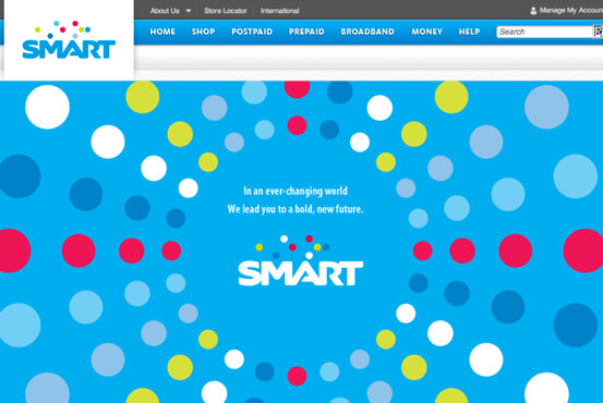
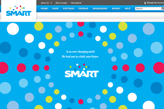
I was surprised to see a new landing page for Smart Communications’ website. I was greeted by a bright blue background with a very colorful bubble design. Then at the center was the message “In an ever-changing world, we lead you to a bold new future”.
I thought that Smart merely changed its website design. Then I noticed that the font of the SMART logo is a bit different, and the logo at the upper left sports the same font and shows the same “bubble” design, although this version has a white background.
I will have someone from Smart confirm the logo re-design but I think its clear enough from the website.
What can you say about the design of Smart’s new logo? Do you like it?



9 Comments
the logo is not as solid as globe..they must have designed something innovative yet simply amazing..which would make all people wow when they came across the logo..anyways logo is just a representation,the services are not..they must improve it as “amazing” as they can..
yeah what font is it?
what is its font style? can I download the .ttf file?