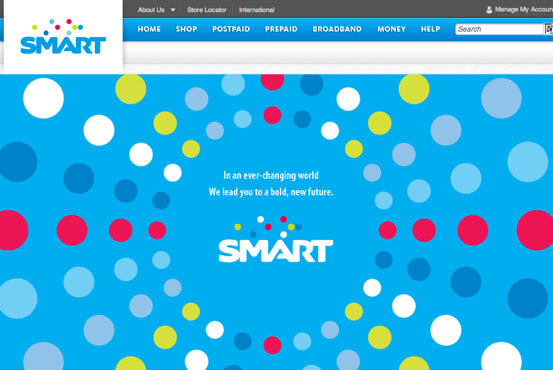
I was surprised to see a new landing page for Smart Communications’ website. I was greeted by a bright blue background with a very colorful bubble design. Then at the center was the message “In an ever-changing world, we lead you to a bold new future”.
I thought that Smart merely changed its website design. Then I noticed that the font of the SMART logo is a bit different, and the logo at the upper left sports the same font and shows the same “bubble” design, although this version has a white background.
I will have someone from Smart confirm the logo re-design but I think its clear enough from the website.
What can you say about the design of Smart’s new logo? Do you like it?



9 Comments
looks like a colorbindness test for me.
PLDT (Philippine Long Distance Telephone) the MOTHER Company of SMART,
Talk & Text, Red Mobile would acquire or rather foster Sun
Cellular…..making the Biggest Telecom Company in SouthEast Asia…..maybe
they are a fan of the Korean Series Boys Over Flowers…SHINWAH Group –
the most powerful & wealthiest company that could deliver every
business deals as they wish………….
About the NEW LOGO of SMART …. this is their way of saying “Live life extraordinarily – simply amazing”
If you would notice lately there have been system enhancements for both Smart networks & Sun Cellular… first, the signal strength of both companies has become stronger – they even become uniform in nature” but then the mobile broadband will surely follow….since this is a merger of the giant companies, we should expect more of them in the following days…………………….
it reminds me of a children’s coloring book
I think they should improve their services not the logo.
I think this only shows that we’ll expect more from SMART not only with their logo but also with their services.