Google has announced their plans during their I/O developer’s conference in San Francisco. They released a bunch of announcements but I’m just going to focus on Android, specifically, Android L (lollipop? licorice? lemon pie?).
ANDROID L
Google announced the latest update to their popular mobile OS. Calling it Android L, it has yet to get a dessert based name that starts with the letter “L.” The new iteration of Android will feature various performance improvements, as well as a new approach to notifications. Combined with the lockscreen, notifications are now interactive. The new drop-down notification, dubbed “heads-up” by Google, shows up when you’re using the phone. It’s a bit intrusive, but easy to address or dismiss.
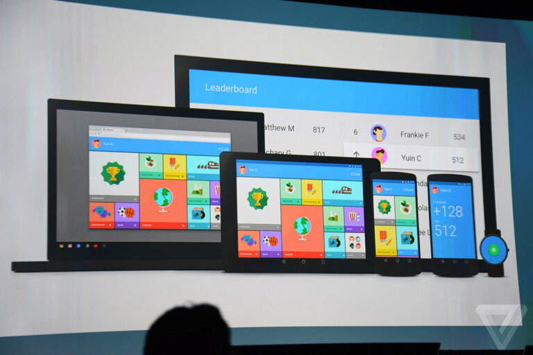
The biggest change brought by Android L is its looks. Featuring what they are calling the Material Design initiative, its suppose to make Android more “human” and approachable. The face lift will have clean, card-based layouts, bright, simple, color schemes, and the playful, physics-based animations. Soon, Material Design will be extended across Google’s products, platforms, and services.
Another notable improvement is the use of Art run time, instead of Dalvik. Basically, the main difference between the two is the way they handle applications. Dalvik used a JIT (just-in-time) compiler that ran code when you need it (or as soon as you tap an app). ART uses an AOT (ahead-of-time) compiler to process code in advance. The result is a faster and smoother interface and launch time of apps, as well as less battery usage. This has been around since the launch of KitKat as an experimental run time, hidden in the developer menu.
GOOGLE CARDBOARD
One cool thing they gave to attendees of the Google I/O developer’s conference is the Google Cardboard. It’s basically a cardboard box that you assemble to something that looks like a pair of goggles. Something akin to the Oculus Rift, it simulates a virtual reality experience using an app and your smartphone.
I’m actually excited with the changes made by Google. I find it interesting that they are parting ways with the Holo design that was introduced way back when, and switching to a more functional aesthetic. Also, I’ve been using Art run time on my phone for a week now, and so far its been okay. Not sure if the “quickness” I’m experiencing is just a placebo effect though.
Source and Images from Fast Company | The Verge


