


Global color authority Pantone announces its Color of the Year 2022 named Very Peri or PANTONE 17-3938. The color is a mix of blue and violet-red undertones, the new color illustrates the fusion of modern life and how color trends in the digital world are being manifested in the physical world and vice versa. It represent the spritely, joyous attitude and dynamic presence that encourages courageous creativity and imaginative expressions.
For 2022, the company decided to creat a new color, instead of choosing one from its existing stable of hues.
“Creating a new color for the first time in the history of our PANTONE Color of the Year educational color program reflects the global innovation and transformation taking place. As society continues to recognize color as a critical form of communication, and a way to express and affect ideas and emotions and engage and connect, the complexity of this new red violet infused blue hue highlights the expansive possibilities that lay before us,” said added Laurie Pressman, Vice President of the Pantone Color Institute.
The company also shared the color harmonies that compliments Very Peri, to help bring the new hue into designs. Each palette conveys a different mood, illustrating PANTONE 17-3938’s versatility.
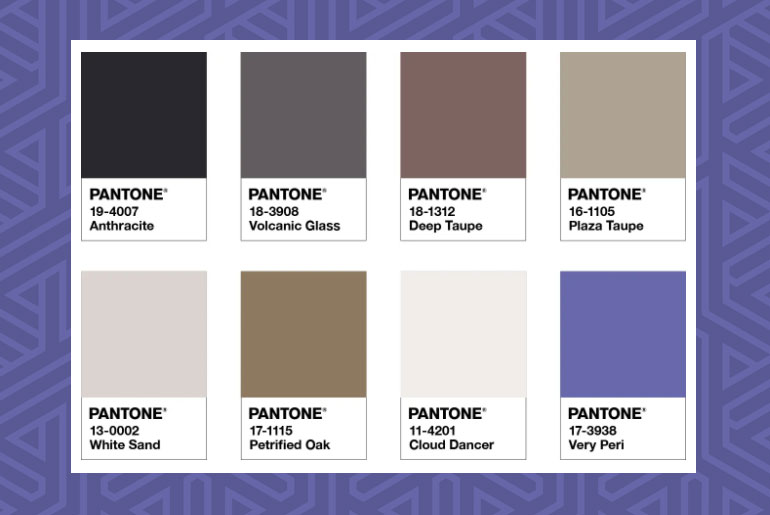
BALANCING ACT
Balancing Act is a complementary palette of color whose natural balance of warm and cool tones support and enhance one other.
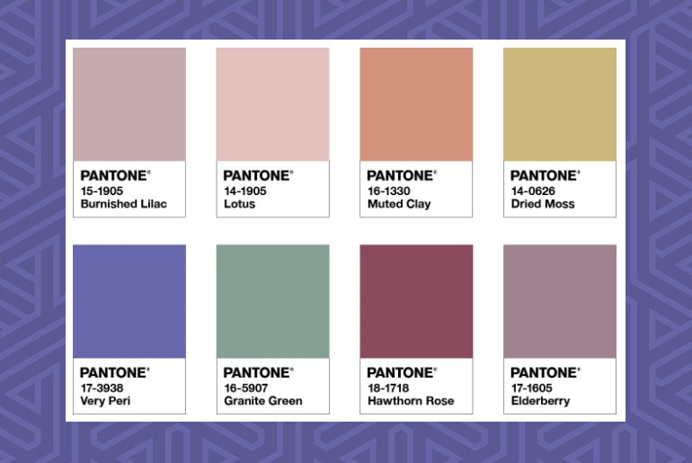
THE STAR OF THE SHOW
The dynamic presence of PANTONE 17-3938 Very Peri comes through in The Star of the Show, as we surround this happiest and warmest of all the blue hues with a palette of classics and neutrals whose essence of elegance and understated stylishness convey a message of timeless sophistication.
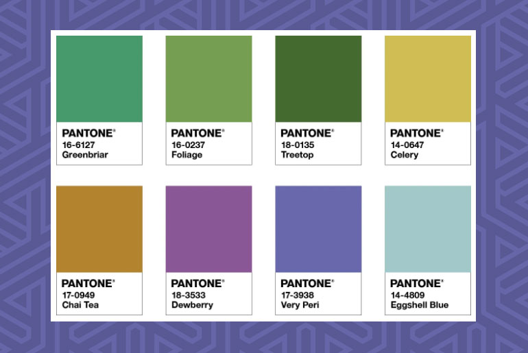
WELLSPRING
A holistic and harmonious blend of nature infused shades, Wellspring highlights the compatibility of the greens with good-natured PANTONE 17-3938 Very Peri, and the health-giving properties of these deliciously subtle and nourishing hues.
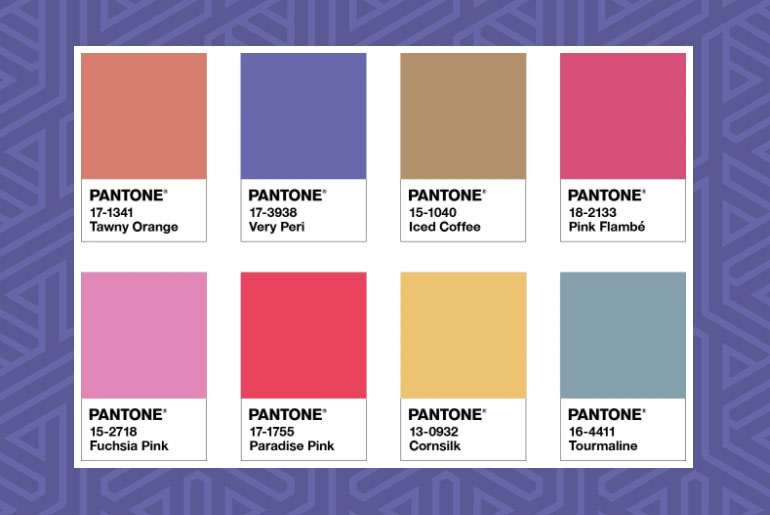
AMUSEMENTS
Amusements, a joyous and whimsical color story of irrepressible fun and spontaneity is amplified by the carefree confidence and joyful attitude of PANTONE 17-3938 Very Peri, a twinkling blue hue whose playfulness emboldens uninhibited expression and experimentation.
Source: Pantone

