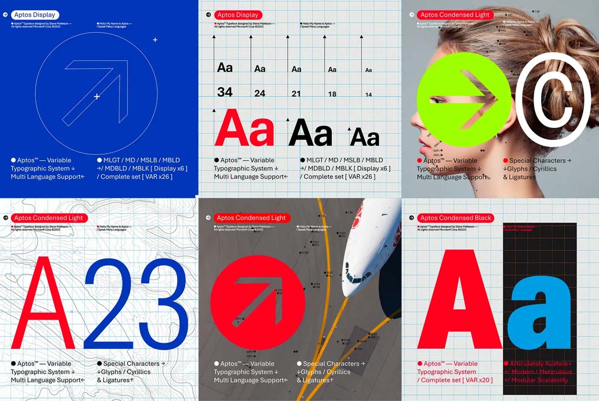
Microsoft Office users will soon notice a change in the appearance of their documents, emails, and presentations. The software giant has announced that it is replacing Calibri, the default font since 2007, with Aptos, a new sans-serif typeface inspired by mid-20th-century Swiss typography.
Aptos was created by Steve Matteson, a leading type designer who also designed Segoe, the font used by Microsoft on Windows, and worked on the development of the original Windows TrueType core fonts. Matteson named Aptos after his favorite unincorporated town in Santa Cruz, California.
According to Microsoft’s principal program manager Si Daniels, Aptos was chosen as the new default font after collecting feedback from customers who tested five potential options commissioned in 2021. Daniels said that Aptos “articulates many different languages and tones” and has “subtle circular squares within the letters’ contours” that allow higher legibility, especially at small sizes.
The change is part of Microsoft’s broader plan to make its productivity apps more expressive and inclusive.
The implementation of Aptos as the new default font will take place over the next few months across Word, Outlook, PowerPoint, and Excel for hundreds of millions of users. However, those who prefer Calibri or any other font can still change it via the settings. Calibri will also remain pre-pinned at the top of a new font menu, alongside its predecessors Times New Roman and Arial.


