
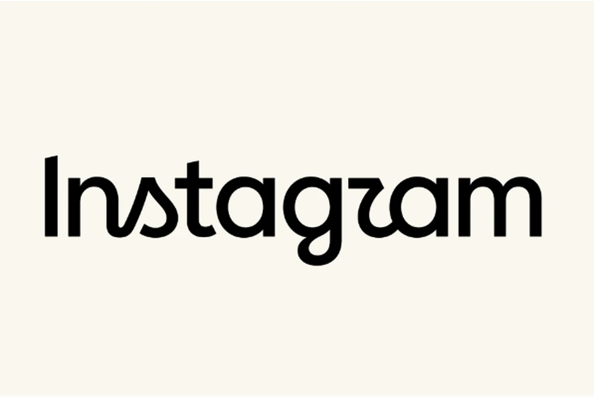
Instagram just rolled out a new logo wordmark, its first change in 10 years. The update is meant to look cleaner and more modern while keeping ties to the old design.
The wordmark now uses a mix of cursive and print letters, replacing the script style introduced in 2016. Instagram head Adam Mosseri said the refresh was overdue and aimed to make the brand feel up to date yet familiar.
The gradient camera icon stays the same, so users will still see the classic pink and purple symbol on their phones.
Reactions online came fast. Some joked the new logo didn’t look right. Others said it was hard to read and questioned if it was accessible. Many also argued Instagram should fix bigger problems like AI content filters and account recovery instead of focusing on design.
Even with the backlash, Instagram is moving forward. The new wordmark will appear across the app and official branding worldwide.
Also Read: EU warns Meta over ‘addictive’ Facebook and Instagram features
This is Instagram’s first big logo change since 2016. For what it’s worth, the logo looks modern. I don’t think it’s that bad.
